Being
A snack brand launched in 2020, focussed on clean, organic, seasoned mixed nuts with a higher purpose. Snack with intention.
*Update, May 21st 2020:
We’ve won a coveted Muse Creative Award for this project’s packaging creative. We’re thrilled and couldn’t be happier!
About The Project
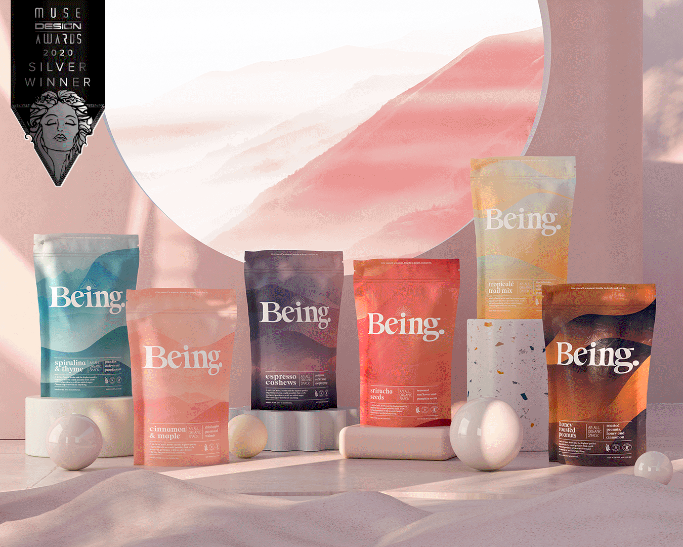
Being is at heart, a brand with a purpose. Dedicated to bringing a little peace to your day, the idea behind the brand is to take a little break from your day, sit quietly, and enjoy a small moment of peace - to just be. The snacks they produce are from the earth, organic and provide the excuse and vehicle to give yourself this little moment.
We wanted the package design to reflect this, through and through. Especially in a crowded category filled with clear windows, pictures of nuts and fruits, and all manner of sweets, preservatives and "natural" colors, we took an approach that was brand and mission-forward.
The solution was to visualize the feeling and calm one receives from peace, quiet and meditation, and bring that through the subtle imagery, color and typography.
What we did:
Brand Strategy
Naming
Brand & Identity Design
Packaging Design
Illustration
Web Design
All Collateral
Social Strategy, Posts & Design


How We Designed:
Colors: We were inspired by nature for each SKU color, gathering hundreds of images of sunsets and sunrises from all over the globe and layered the gradients on top of each other. Peaceful landscapes were overlayed onto each pack to bring out the natural elements and sources of the ingredients.
Texture: We chose a soft-touch, textured stock and applied a small amount of grain to the final artwork, further strengthening the tangible, natural feeling and aesthetic of the packs. We want you to have an emotive response to the pack before you ever taste the product.
Minimalism: Looking at the market and category, we found very few products competing in the arena of seasoned mixed nuts and wanted the entire pack to reflect that this was not your regular nut-based snack. We aimed for something pleasing to the eye, calming to the mind, with only the essential information that perfectly represents the product itself: no additives, no hype, nothing but basic ingredients from nature.
Typography: We designed a layout that made great use of negative space, and a hierarchy which communicated the key information quickly and quietly. We used two brand fonts - the second hand-feel type font sparingly - only to accentuate the organic, natural, ingredients and health benefits.


